Nature of Phones
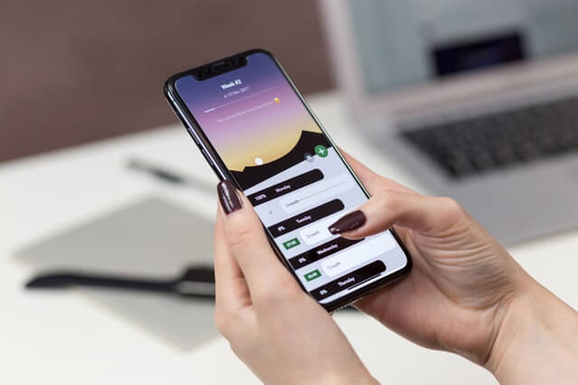
Since the first smartphone was invented, IBM’s Simon Personal Communicator, vertical screens have been applied to the vast majority of devices. The vertical design allows users to operate the device using only one hand. A study in 2015 reported that users hold their phones upright 94% of the time.
People Are Lazy
With the degree of inactive children growing and the population’s attention span reducing, people are seeking the easiest and fastest option. Whether it be driving to avoid the five minute walk or heating a meal in the microwave instead of the oven. Competition in technology has led to the continuous improvement in the user experience (UX). Ultimately, we’ve reached a point where turning our phone sideways is too much effort, especially in a fast-paced social media world. Therefore, vertical video is pleasing users and allowing them to have a full screen experience without the task of turning screens.
Social Media Apps on Mobile
Social media applications function on mobile devices 80% of the time. The biggest social platforms embrace the portrait format in various ways – Snapchat pioneered stories, Facebook embedded a livestream feature and Instagram has IGTV. Many will agree that Instagram was a significant catalyst in vertical content’s growth as it continuously pushed the envelope through its story features – GIFs, polls, questions, quizzes, music and shopping.
If you want to make sure that your images stay within Instagram’s image dimensions and look awesome on your feed, then use Instasize which is a free photo editing app.

For instance, the image above shows a screenshot of Matt Pyke sharing some free SEO tools through IGTV. As this is a personal video, aiming to connect to the audience on a one-to-one basis, the vertical aspect amplifies the user experience by making it more close and personal.
Fewer Distractions
With the natural designs of mobile phones, vertical content will cover more of the screen and therefore provide fewer distractions.
For example, a 1080px x 1350px image is displayed uninterruptedly, acquiring the majority of the smartphone screen. While it receives fewer distractions from other posts and features, it also takes longer to scroll past. This increases the chance of followers paying attention to the post and potentially engaging with it.
Conversion Rates
Due to these benefits, vertical content has experienced more attention, focus and engagement. In fact, Snapchat reported that vertical full-screen video ads converted 9x better than landscape. It comes to us as no surprise that visual content, displayed on a full screen without the need to turn the smartphone, experience better conversion rates.
Do you utilise vertical content?
To view some creative examples where brands have experimented with vertical content, have a look at this blog by Sked Social.

