The Ultimate Conversion Rate Optimisation Guide For Your Website
What is Conversion Rate Optimisation (CRO)?
Conversion Rate Optimisation (CRO) is the process of improving a website to increase the percentage of visitors that complete a business’s desired action. For example, the desired action can be anything deemed important to the business, whether that be a visitor filling out a form, making a purchase, or signing up for a newsletter.
After reading this blog, download our CRO guide (by clicking the red button at the end of this blog) to discover tips to increase your website’s conversion rate.
CRO involves understanding how visitors move through a business’s website, their actions, and what prevents them from converting (completing a business’s desired goal). The process helps a business to establish how their visitors behave on their website, i.e. the content they engage with, and discover where they leave the conversion funnel (exit the website).
Conversion Rate Optimisation is beneficial if you wish to take your business to the next level. Changes to your website can make a huge difference to your bottom line.
Why is Conversion Rate Optimisation important?
There are many reasons why CRO is important for businesses.
First, CRO can positively impact the efforts of Search Engine Optimisation (SEO), which is the process of helping your website to rank on a Search Engine Results Page (SERP) with the aim of drawing in more website traffic organically.
CRO also helps to:
-Improve your understanding of your target audience by giving you insight into which messages and call-to-actions (CTAs) work most effectively.
-Refine your acquisition efforts, such as helping you find ways to retain your customers and increase their value, rather than just trying to acquire new ones.
-Enhance your visitor’s user experience (UX) by understanding the areas of your website that can be optimised.
-Generate more leads and sales.
Later in this guide, we will provide in-depth tips on how you can increase your conversion rate to achieve the above. But first, you need to learn how to measure this metric to gain an understanding of when your CRO is improving.
How do you calculate a conversion rate?
A website’s conversion rate is calculated by adding the goals completed by website visitors, dividing them by the website traffic, and then multiplying it by 100.
For example, if a visitor converts each time they are on your website, i.e. if they purchase a product, then divide the number of conversions by the number of sessions (the number of unique website visits) before multiplying the number by 100.
Below are some example equations for working out various conversion rates.
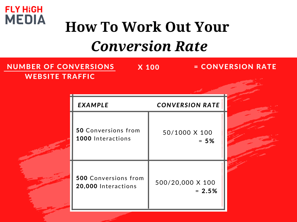
You should now be able to work out your business’s conversion rate, which will help you to understand whether it is where you want it to be.
What pages should be prioritised?
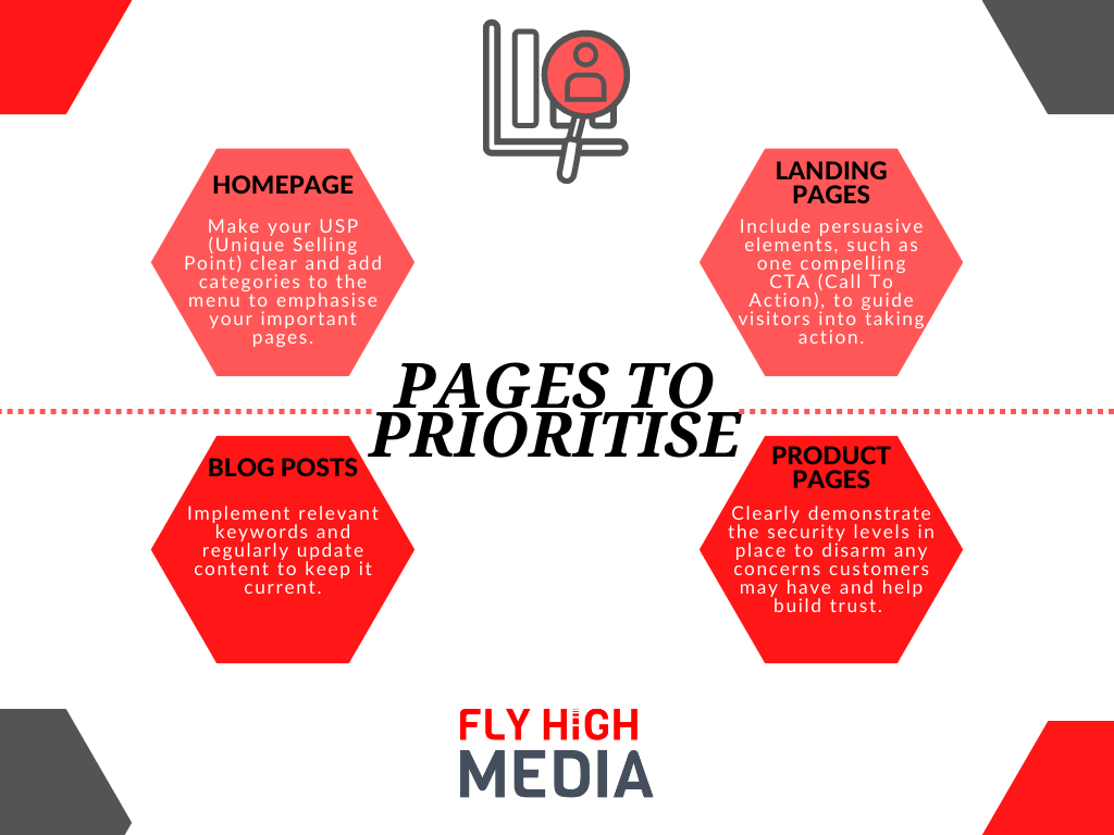
When beginning the CRO process, there are certain pages that you should initially focus on as a priority. The pages we recommend you focus on first are the homepage and key landing pages/product pages; however, the pages you select after these may vary slightly depending on your business.
For example, an e-commerce website will require its product pages to be optimised for conversions, and this should be the priority over blog posts. However, for a service-based website, the main objective may be to advise or inspire visitors by providing valuable information via blog posts, so it will be crucial to focus on CRO in this area.
Ideally, all of your web pages should be analysed and optimised, but the following pages are the ones that have the most potential to benefit your business and should be treated as a priority.
a) Homepage
The homepage is generally the first impression a visitor has of a website (and your business). This is where they can either be intrigued enough to search the other pages on the site or the opposite and decide to exit.
Your homepage should convey a clear message to visitors, so they instantly understand what you offer. For example, your unique selling point (USP) should be transparent so that your visitors can quickly evaluate how you compare against your competitors and the value you can bring to them.
Additionally, across your whole website, you should have clear and simple navigation to help users get to their desired destination as quickly as possible.
b) Landing pages
The purpose of a landing page is to encourage visitors to take action. For example, persuading them to sign up for a newsletter, submit a form, or to purchase. In simple terms, it is designed to convert visitors into users with the intent to buy.
With regard to sign-ups, landing pages have the highest conversion rate at 23%, which emphasises the importance of optimising them for conversions.
Furthermore, a landing page should be one of the first pages you optimise on your website since it doesn’t tend to be evergreen content. This means a landing page may not be continually relevant, so it has to convert visitors whilst it is ‘current’.
c) Blog posts
Blog posts are an important part of the buying journey for customers. You have the opportunity to take them to the next stage of the funnel or even to persuade them to convert.
Additionally, valuable blog posts help to create long-lasting relationships between businesses and customers, so it is an area of a website that can bring in high conversion rates, which is achieved by implementing relevant keywords, relevant internal links, and compelling CTAs.
As a part of the process of increasing conversions, you should conduct content audits to ensure that your blog articles are still relevant and up to date. Having out-of-date or inaccurate information can be damaging to your website.
Quick tip: Check Google Analytics or Google Search Console to find your blogs with high traffic, and add call-to-actions if you haven’t already. This could be to download an ebook or sign up for a newsletter.
d) Product pages
Product pages are the critical stages of a visitor’s journey on your website, which means you need to make it as easy as possible for a visitor to convert, i.e. make a purchase.
Product pages are where you can provide a breakdown of prices, descriptions of the products, and FAQs to disarm any objections people may have.
To further improve your product pages, all images should be clear, relevant, and have ALT text. ALT text enables your content to be understood by a wider audience, ensuring that you are not excluding those with visual impairments.
What are the main elements of a high converting website?
a) Solid CTAs
A Call-To-Action (CTA) is an action that businesses want users to make whilst on their website. It could be that they make a contact form submission, phone call, purchase, or sign up to an email/newsletter.
The key to a good call to action is to stand out from the rest of the site and to be as simple as possible.
b) A flawless user experience
Your website should be designed primarily with people in mind, and not just search engines and algorithms.
You should focus on optimising areas of your website that help to improve user experience (UX), making the path you wish them to take visually clear (signposted) and easy to navigate.
For example, to assist with your user’s experience, your website should have a straightforward navigation bar, and prominent drop-down menus (if required), and the loading speed for each web page should be fast.
Additionally, any features, such as CTAs, should be in relevant places, your business’s contact details should be in a prominent position, and all links and buttons should be working correctly.
c) Content
The results that appear in SERPs are driven by content, which means that content is key to driving qualified buyers. So, your content needs to work hard to help you increase your conversion rate.
Since 53% of consumers research a product before purchasing it would be a mistake to not optimise your content on a blog or webpage to ensure it first appears in their SERPs and, secondly, is a valuable source of information, whether that be educational or inspirational.
Quick tip: You must ensure that you carry out thorough content plans and keyword research so that the content on your website is relevant to your audience. If you send unqualified traffic to your site, then your website will always struggle with its conversion rate.
What are the best Conversion Rate Optimisation practices?
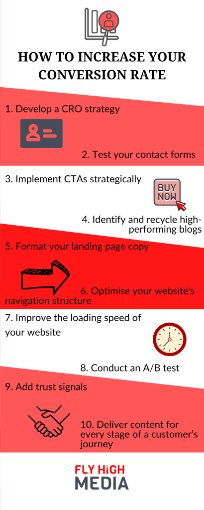
At Fly High Media, we recommend that you conduct the following CRO practices to help you reach your desired conversion rate.
1) Develop a CRO strategy
If you want to improve your conversion rate, first, you need to find what is initially driving people to your website. Why are they there? What are their needs? Analyse your website data to discover where your visitors are coming from, i.e. the ad or specific search (the queries made in search engines) leading people to your website.
Once you have gathered information around the above, you should be able to define your target audience and understand how to personalise a message/journey for them. This will enable you to prioritise the demographic most important to your business, tailoring content for them since you know it has the highest chance of leading to a conversion.
To help you find the answers you need, you should conduct keyword research using a tool, such as SEMrush, to discover the keywords that are helping rank in Google. Additionally, you could implement an on-page survey that includes a few specific questions for your visitors.
For example, you could ask, ‘how would you describe yourself?’ (to help understand the demographic), ‘what’s the main reason for your visit?’ (to learn the driver), and ‘was there anything you weren’t happy with today?’ (to identify what might be preventing visitors from taking action).
It’s important to discover what persuades your visitors to act. So also consider including questions for your customers to help you find out the tool, piece of content, or factor that persuaded them to convert.
It is equally important to discover what stops a reader from going further down the funnel, whether that be early on in their journey or just before they are about to convert from a visitor to a customer.
Identify where your visitors leave your website. Your high-exit pages should be optimised for conversions. Alternatively, ask yourself, ‘are these pages necessary?’. If the answer is no, then consider removing them. Inefficient web pages can be an extra hurdle for your visitors, creating another reason for them to leave your website. Instead, focus on optimising the pages that draw the most traffic.
Consider building a Custom Funnel to help you visualise the steps a visitor took to complete a task and to identify the final touchpoint before a conversion.
2) Test your contact forms
Contact forms provide an efficient way to gather your audience’s information so that you can contact them in the future and, ultimately, convert them into customers.
However, successfully gathering contact details from your target audience can be considered a conversion in itself, and it can be difficult to achieve.
To create an effective contact form (one that increases the likelihood of a visitor converting), you should:
-Make the benefit for your visitors very clear.
Your visitors will not give you their contact information if they don’t understand what they will gain from it. More and more people are limiting how their contact details are used, so if you are asking a visitor to take the time to leave their contact details, there needs to be a benefit for them. What are you going to offer them? Will you be sending them regular discounts on products/services? Is there a monthly newsletter full of valuable information that is relevant to them? Whatever the benefit is, state it clearly on the contact form.
-Include a compelling CTA.
You must provide benefits for your visitor. Without either of these aspects, your contact form is unlikely to gain much traction. Your CTA should be in a prominent position on the page and the message should be clear and persuasive so that your visitors understand what you would like them to do. Essentially, your CTA is a button that acts as a signpost, indicating to your visitor the next step they should take, pushing them further down the funnel.
-Include a thank you message.
Once your visitor has converted (provided their contact information), it is a good idea to have a thank you message appear. This will help to build trust with your visitor as it will indicate to them that you value their presence. Trust is a necessary foundation you can keep building on to help your visitors feel more inclined to take any desired next steps, such as purchasing a product/service from you. The thank you message can pop up as soon as the visitor submits their contact information. This can also include a reminder of how the visitor will benefit from leaving their contact details along with what they can expect from you shortly and when to expect it. Additionally, this would be a good opportunity to let your visitors know how they can opt out of receiving your emails if they decide to.
-Optimise for mobile devices.
Since it is estimated that 6.8 billion people use a smartphone you should ensure that your website is accessible on mobile devices. For example, your content should be readable, and all features/buttons should be large enough to tap. To optimise your contact form for mobile devices, you should use a responsive design. This will ensure that the copy, fields (where the visitor needs to input their contact information), and CTAs are appropriate sizes according to your visitor’s screen size.

3) Implement CTAs strategically
As previously mentioned, CTAs can be an effective tool for gaining conversions.
But many CTAs fail in their purpose. Why is that?
First, not everyone reads to the end of a blog or to the bottom of a page, where CTAs are typically placed. Additionally, many people have become accustomed to certain forms of advertising, learning to ignore banner-like information and prefer to respond to a more soft-selling approach.
To help with your conversion rate, consider implementing CTAs within your content itself. For example, include internal links within your blogs, which will lead readers to a page where you hope to make a conversion, such as a product page, once they click on it.
The internal links that tend to work effectively are positioned in a way that makes sense to the reader. For example, internal links should not interrupt the flow of the copy, and they should be relevant to the blog so as not to distract the reader.
If applied correctly, internal links within a blog can be a subtle, non-pushy method to gain conversions, which is a soft-selling technique.
You could also place a CTA near the top of a landing page, which will not be easily missed because of its prominent position.
When creating CTAs, be sure that:
-They include actionable words, such as “Learn more” or “Download now”.
-The benefit to the reader is clear.
4) Identify and recycle high-performing blogs
Try to identify your high-performing blogs. These are the blogs that you should continue to improve.
First, you could expand upon your high-performing blogs, implementing popular keywords so that they appear on more people’s SERPs.
Conduct keyword research using a tool, such as SEMrush, to discover the high-ranking keywords relevant to your blog and then add to the copy, headings/subheadings, meta description, and URL, if possible.
When implementing keywords, remember to:
-Use content that is relevant to the keyword and vice versa. You should create your content with the reader in mind, not just search engines, so the information you provide should make sense and be valuable.
-Avoid keyword stuffing (no more than 1 to 2 mentions of the keywords per 100 words).
-Add your most important keyword within the first paragraph of your blog.
-Use variations of your keywords throughout your content to help the language flow naturally. This can also assist with LSI (Latent Semantic Indexing), which is the process that search engines use to scan and retrieve information.
Additionally, once you have discovered your high-performing blogs, you could consider updating them so that they remain current with up-to-date facts. Recycling content will save you time, plus it will enable you to keep your valuable content current, expanding the likelihood of it being seen by a wider audience.
Quick tip: SEMrush can help you to discover your most popular blogs. Use the tool to assist you when conducting a content audit.
5) Format your landing page copy
A landing page should be structured in a way that guides your visitor into converting, i.e. from visitors into customers, or readers into subscribers, so every element needs to be persuasive rather than littered with distractions that could prevent a conversion. For example, on a landing page, the ability to navigate off the page should be limited or non-existent, and competing internal/external links should not be present.
The first few seconds of a visitor viewing your landing page are crucial; they should be able to quickly evaluate the value your business can bring to them, otherwise, they may exit your landing page, which will increase your bounce rate.
Here’s how you can reduce the exit rate for your landing pages:
-Your USP (Unique Selling Point) should be clear. It should be defined by your headline (a brief, succinct line at the top of your page) and in the first few lines of your copy. Both the headline and introduction should be short and succinct so that your readers can quickly understand what you are offering.
Additionally, you could add media to support your USP, such as an image or video, to help emphasise the benefits of what you are offering,
-Your landing page should demonstrate the social proof of your business. For example, you should include reviews, case studies, or scores from Google and Amazon.
-The copy on a landing page should be compelling and optimised for search engines by using relevant keywords.
-Only include one CTA. This can be implemented on your landing page as a form, a link, or a button
6) Optimise your website’s navigation structure
Your website should be designed to make it as easy as possible for your visitors to navigate around.
For a navigation bar to be effective, it should:
-Be consistent, from page to page.
-Be divided into categories, i.e. categories and subcategories should be clearly defined.
-Be relevant, with all categories named accurately to suit the page it is linking to.
-Include a logo that links back to the homepage if a visitor clicks on it.
-Include a search bar to make it easy for visitors to find something in particular.
You should consider your top-performing pages and create categories for them, positioning them in places where they will be spotted easily by visitors, such as near the beginning or the end of the navigation bar.
Page depth is also an important aspect to think about. For example, how many clicks a user has to make to reach the page they are after.
Ultimately, the menu type you use will depend on your website and the products/service you offer. There are various menu options, such as the hamburger menu, double menu bar, and the mega drop-down.
7) Improve the loading speed of your website
The loading speed of a website can affect the user experience. For example, if it takes too long for a page to load, your visitors may become impatient or even stressed, increasing the likelihood of them abandoning your website.
Ideally, your web pages should load within 3 seconds. If you have an e-commerce website, then it should load, ideally, between 1 and 2 seconds. Most visitors will exit if it takes any longer than this, which will increase your bounce rate.
A slow-loading page can also affect your SEO ranking. According to Google, they only allocate a certain amount of time to crawl and index a page. So, if the pages of your website take too long to load, Google will not have time to review them all. This means that you may receive a lower ranking since your whole website could not be assessed.
To improve the loading speed of your website, you should:
-Optimise images. Give them descriptive names, add ALT text to include relevant keywords, use smaller images that give visitors the option to zoom in, decrease the size of image files, and choose the right file type.
-Enable compression to reduce the size of larger files, such as CSS, HTML, and JavaScript files. This is the process of compressing data files before they are sent to your visitor’s browsers.
–Leverage browser caching, so that when someone returns to your website, the entire page will not have to reload.
8) Conduct an A/B test
A/B testing (also referred to as split testing) is a method that can be used to test the most effective version of a tool to help provide an optimised user experience.
For example, if you are unsure of the CTA to use on a page, you could test two versions to see which performs better, i.e. which makes the most conversions.
9) Add trust signals
If your visitors feel secure on your website, they are much more likely to trust your business and feel inclined to convert, i.e. make a purchase.
For example, if your visitor can see that your URL contains the letters HTTPS, then this will indicate to them that your website is certified (by way of an SSL certificate), so that communication is encrypted to help prevent unauthorised access.
Additionally, if you have an e-commerce website, you should emphasise to your visitors the security levels that are in place once they reach the payment stage. For example, use visual clues, such as the padlock icon (to indicate that the security measures implemented are to industry standards) and sensitive credit card fields.
10) Deliver content for every stage of a customer’s journey
To lead your visitors effectively to where you wish for them to convert, it’s important to include relevant content for where they are in the funnel.
You should aim to provide content at every stage of the funnel, i.e. the awareness, consideration, and conversion stages. For example, you should:
-Make your potential customers aware of the products/services that you offer. You can do this via social media, paid ads (PPC), or by gaining backlinks to high-authority sites, which will help to emphasise your credibility.
-Increase your customer’s interest in your services. You can do this by creating blogs that contain valuable information on a product/service or through visual content, such as a video demonstrating how a product/service works as well as how it can meet your customer’s needs.
-Develop your visitor’s interest and confidence in your products/services to increase the likelihood of them converting (becoming a customer). You can do this by including case studies and reviews on your products/services pages to social proof your business and further build trust.
What are the best tools to use for CRO?
To help you devise a CRO strategy and keep track of the results gained from your CRO efforts, there are a variety of tools you can use, such as:
-Google Analytics 4
-SEMRush
-Hotjar
-Ahrefs
Ideally, you should create a CRO checklist to help you spot any areas that could be optimised further for conversions.
Can a chatbot improve CRO?

Chatbots can either be automated (artificial intelligence technology) or a live chat where the business’s employees can message customers.
This technology allows businesses to respond quickly and effectively, helping to personal a website visitor’s journey.
Furthermore, chatbots can also collect real-time data, providing businesses with insights into how users are behaving on a website. These insights can assist businesses when looking for ways to improve UX, and, ultimately, conversion rates.
To conclude, conversion rate optimisation is a process that every business should undertake, particularly if they wish to increase their ROI.
Hopefully, this CRO guide will have emphasised the importance of optimising your website and the most effective ways you can increase your conversion rate.
From Website Design to content creation, Fly High Media can offer a variety of services to help you improve your website.
Additionally, we have devised a downloadable CRO guide for you to refer to if you wish to know how to increase your conversion rate.
Frequently Asked Questions
What is CRO?
CRO (Conversion Rate Optimisation) is the process of improving a website to help increase the percentage of visitors who convert, i.e. become a customer.
A business may class any particular action that a visitor completes as a conversion, whether that be purchasing a product, downloading a brochure, or signing up for a newsletter.
Why is a good conversion rate important?
A good conversion rate is important for businesses because it means that their marketing efforts are effectively converting their website visitors into customers.
For example, the CTAs that are implemented, the layout of the website, and the quick loading time of a web page can make all the difference between a visitor exiting the website or, instead, converting from a visitor to a customer. The more people that convert, the higher a business’s conversion rate.
What is a good conversion rate?
An average conversion rate for a website is between 2 and 5%, so any website that can achieve a higher conversion rate than this is considered well-optimised.
How can I optimise the conversion rate on a website?
To increase your conversion rate, you should target particular areas of your website, such as the homepage, any landing pages, blogs, and, for e-commerce websites, product pages.
To optimise these areas, you should:
-Develop a CRO strategy.
-Test your contact forms.
-Implement compelling CTAs.
-Recycle high-performing blogs.
-Format any landing pages.
-Improve your navigational structure.
-Improve your website’s loading speed.
-Conduct an A/B test.
-Add trust signals.
-Deliver content for every stage of a customer’s journey.
What are conversion optimisation tools?
CRO tools collect a website’s data to enable businesses to understand how their visitors behave on their website. Additionally, CRO tools help businesses to learn what is working well and what isn’t by analysing and measuring the results gained from their efforts.
If you wish to learn more about how your website is performing to help you improve your conversion rate, consider using the following:
-SEMrush
-Google Analytics 4
-Ahrefs
-Hotjar
Contact Us
Cheshire (Head Office)
Manchester
Get in touch
Let’s find the best solution for your business
